RIJ Construction
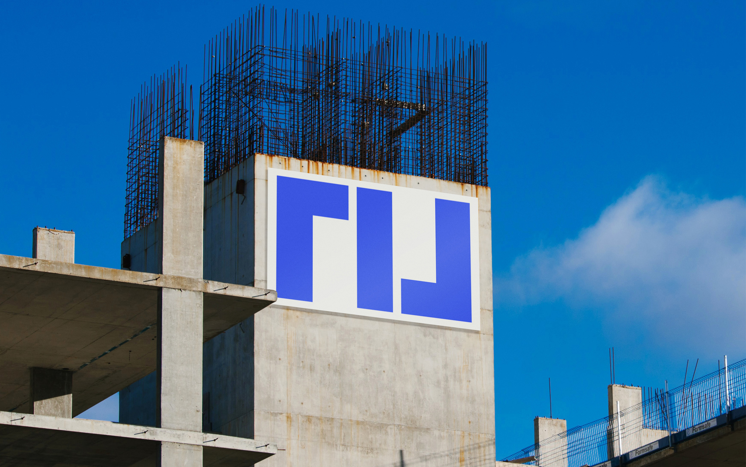
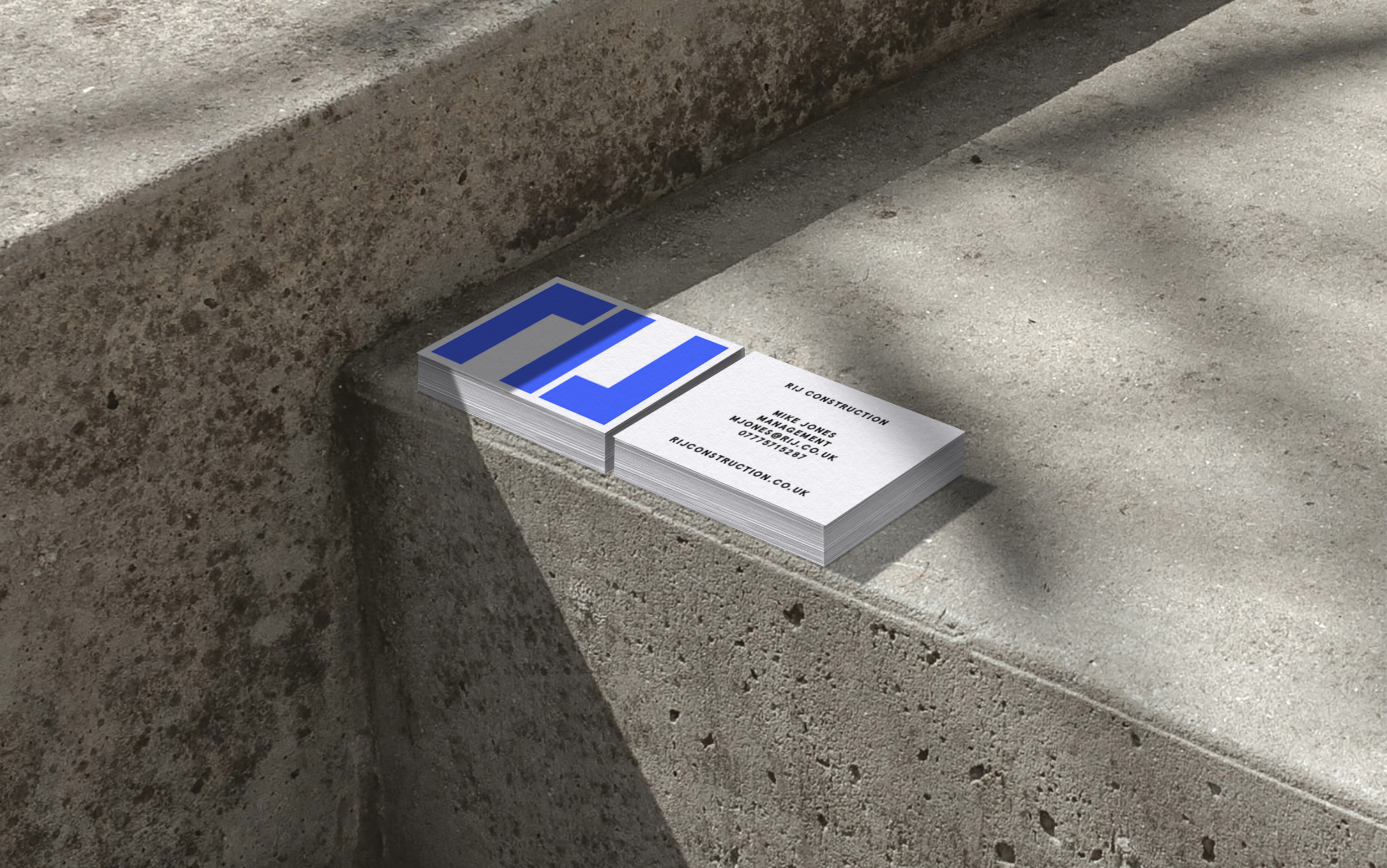
The brand identity for RIJ Construction, uses tetris-inspired typography that when stacked creates a brick wall pattern.
The original brief from the client was simple; 'create a brand that stands out within the construction industry'. As a result, a clean, symmetrical brand was developed, with a central focus on versatility and ease of appplication.
The brand is bold and bright, firmly inspired by architectural blueprints as seen reflected in the colour palette. The collateral can be applied confidently accross multiple applications.